My Clover
My Clover is the first responsive web application built for all active members of Clover Health. With My Clover, Clover members were able to access their digital ID card, look up personalized plan benefits, and easily find in-network doctors. As with most start-ups, we were racing against the clock on this project. Through the course of only 3 months, we were able to develop a product strategy, validate a prototype, and launch a complete product to all 40,000 of our Clover members!
Client
Clover Health
Role
Lead Product Designer
Team
Front End Engineer (Jesus G.),
Product Manager (Olivia B.)

The final product we launched, scroll down to read about how we arrived here.
The final product we launched, scroll down to read about how we arrived here.
Why build a personalized member application?
Prior to My Clover, the only way for a Clover member to get in touch with Clover Health was through a phone call. While a phone call is a great way to deliver a more empathetic and humane touchpoint, it was quickly becoming hard to scale for the company—especially when we were receiving a lot of phone calls to help answer simple questions like, “what is my copay for this medical service?”. We also saw an opportunity to create more personalized experiences for our members. By developing an experience behind a login, we would now have a foundation to begin to help our members directly manage their own health.
Our Goals
We had 2 core goals in mind when we first began speccing out what a minimum viable product could be for My Clover:
Goal 1: Member engagement
Industry trends show that there is a pretty strong correlation between patient engagement and better health outcomes. We wanted to build a product that would form the foundation for scalable engagement. Alongside adding in event tracking to measure the effectivness of each feature, we also measured enagement rates from a product level through number of logins per month.
A reach goal of roughly 50% of registered members logging in at least monthly was set, with the metric based off the industry average as determined by the CDW Patient Engagement Survey.*
Goal 2: Operations efficiency
In 2018, over 40% of our members had called our call center to get more information about their Clover Health plan. When we did an analysis on the call reasons (for compliance reasons, all calls must be documented), we realized that a vast majority of our member calls were centered around the same 3 to 4 reasons, such as wanting to check a plan benefit or requesting a referral to an in-network specialist or primary care doctor. With My Clover, we saw an opportunity to introduce a scalable digital channel to allow our members to answer some of their own questions in a self-service manner. The intention was not to replace our call channel, but to extend a new channel for the contingent of members that would prefer to find answers on their own.
The Starting Point
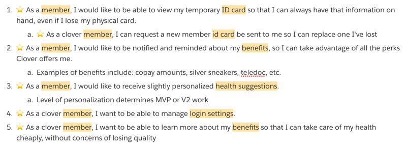
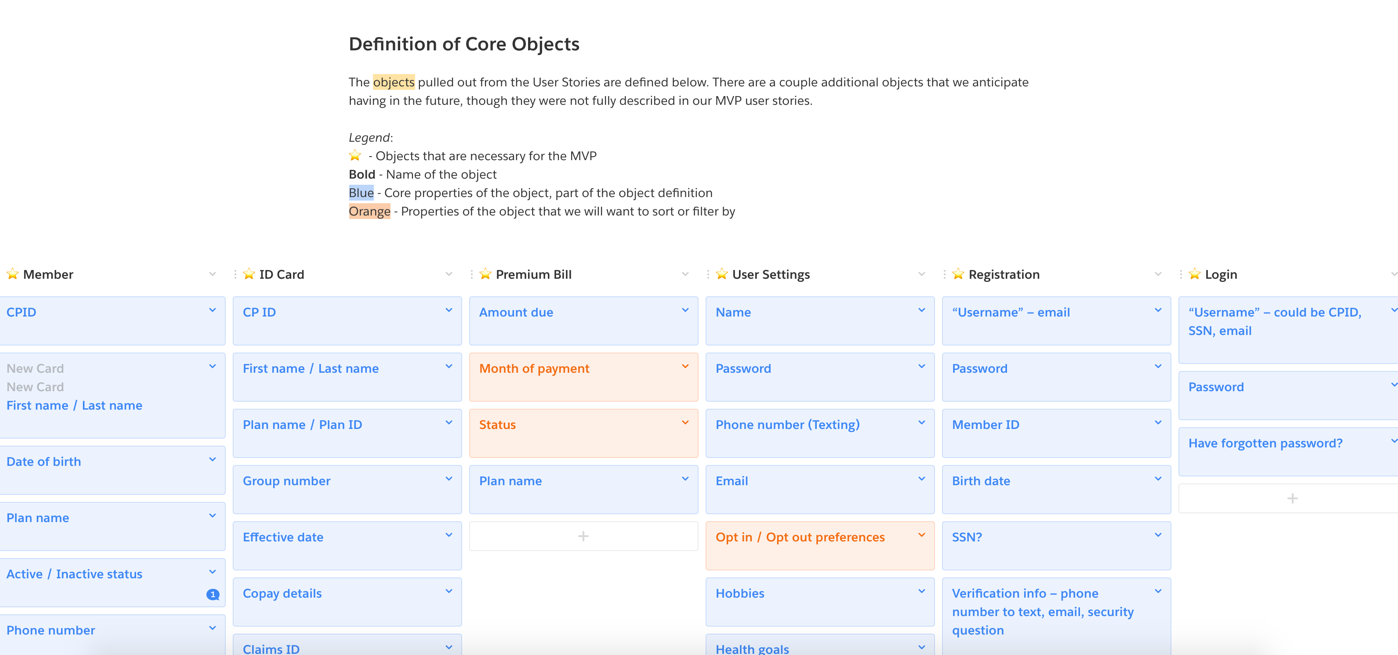
After settling on goals and a deliverable (a launchable application that would be publically available to all Clover Health members), I facilitated an Object Oriented User Experience exercise to create a starting point for the team to begin to think about user flows and interactions.
Following the basic tenets of OOUX—of first defining the core objects in your application before then sketching out potential flows—we began the exercise by defining a set of core user stories. From each user story, we pulled out the nouns from each sentence to become the basis for the core objects. After creating an exhaustive list of core objects, we began defining that object’s properties and meta data. Finally, we defined the actions that may be associated with each object, which would then become the basis for user flows and interactions.
Conducting this exercise formed a strong foundation for both the engineers and the product manager and allowed us to have a framework to build collaboratively.
We initially conducted this exercise on post-it notes, but then we documented the exercise digitally.
Defining the information architecture
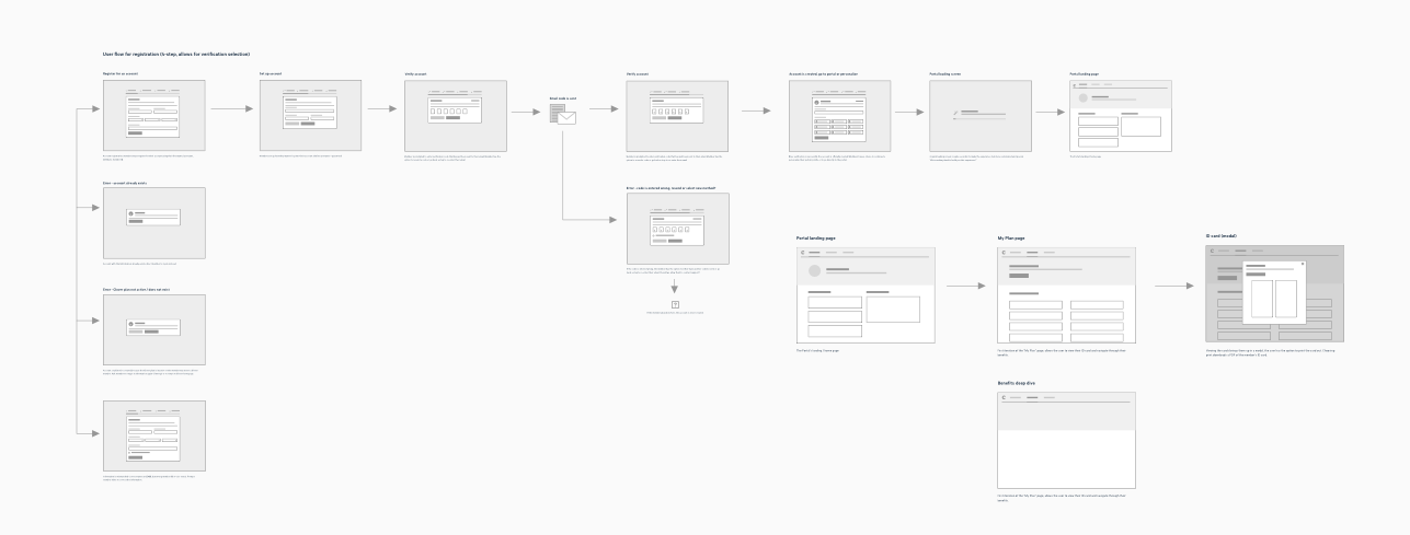
Once we had gathered the core objects, I decided to begin to map out the information architecture for the member application based on the user stories we had originally outlined. Since I wanted to make sure we were designing and developing in a scalable manner, I explored having future functionality in the architecture map as well. Below is one of the artifacts I created to visualize the information architecture of the new application after conducting a card sorting exercise and running light hallway tests on tree tests. We ultimately used this diagram to form the basis of the navigation structure in the application.

Sketches & Wireframes
With a better understanding of what core features this application would need to support, as well as a framework for navigating, I then began to wireframe out interactions and base screens.
I generally like creating thumbnail wires when I want to lightly visualize user flows. It’s been a great way to start conversations with other team members so we can start thinking broadly without getting rabbit holed.
Once major user flows had been agreed upon, I moved onto building out medium fidelity wireframes. With these wireframes, we could start getting more buy-in from stakeholders, as well as start some light prototyping to validate our hypothesis.


The Visual Design
The nature of having a long scrollable page for a case study, makes it seem like a lot of these steps happend one after another. While there was sequencing in the project, a lot of the sketching, wireframing, and visual design did happen in parallel. While working through wireframes, I was also developing a light-weight design system for the customer facing applications of Clover Health. This design system would eventually form the basis of the visual design for My Clover, as well as the provider-facing software another team was simultaneously developing.
Creating a system
Prior to this project, the product and engineering team at Clover Health was mostly focused on building internal tools for the company. A lot of the components and styles used for those internal tools looked nothing like what our brand and marketing material looked and felt. Because this member application, My Clover,would be the first consumer-facing application, we knew that we had to make sure it felt much closer to the Clover brand.


Since we had such a short amount of time, we had decided as a team that it would not be possible to build out a full fledged out design system. Instead, we took the components that we knew we needed to support My Clover (including buttons, form fields, alerts, etc.) and focused our attention on ensuring those components, as well as the visual foundations of the applications, aligned closely with our brand guidelines. At a later point (post-launch), we intended to come back to the system and fully define guidelines, information architecture, layout styling, etc.
The focus on accessibility
The brand guideline that we had on hand was mostly only used for physical, printed items, so part of my responsibility entailed expanding the color palette, detailing font styles for online usage, and building out the basic components that our application would utilize. As with all member-facing experiences in the Medicare Advantage space, I had to ensure that our system matched the WCAG 2.0 and Section 508 guidelines on accessibility. We put in a lot of effort into ensuring accessibility from the way that components were coded to the actual design foundations that I put in place. Eventually we hired a third party vendor to conduct an accessibility audit to ensure that we were adhering to the guidelines we put in place.


Iterating
Once a basic system was set up, I was able to start diving into iterations to fully determine the visual styling of My Clover. Below is a collection of some of those visual explorations. Ultimately, the iteration number 4 was decided upon as the direction to go in. The use of color felt more scalable and flexibile and we liked having the Clover green be the primary denotor of core actions.

Prototypes & Validation
Over the course of the whole project, I was able to conduct 4 separate instances of user testing, across both Clover members and non-Clover members that met our member demographics. All of these user tests gave us important insights, allowing us to validate hypotheses that we had made during the development process.
UserTesting.com
The first user test conducted was with 10 non-members on this Invision prototype through UserTesting.com. The main goal of this test was to gauge the ease of use in the product as well as its visual design.
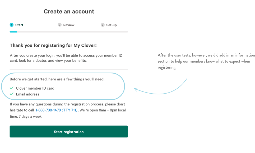
Overall, the design was well received, but we did make a couple adjustments based on the feedback received. We modified the top header navigation by adding an explicit “home” link and claned up the navigation path. We also added in an explicit “back” button to help users navigate between pages after noticing a couple users feeling “rabbit holed” and not easily figuring out how to go back to previous screens.
UserTesting.com gave us recorded videos of the participants for us to rewatch, take notes, and create clips from!
Curry Center in San Francisco
The vast majority of Clover Health members are in New Jersey. Before making the trip over to the east coast to get some user feedback from actual members, we decided to do some in-person interviews and usability testing from our home base in San Francisco.
At the Curry Senior Center in San Francisco, we spoke with 6 participants. Generally the feedback was that the application was easy to use and navigate between, but that the clinical language used in the doctor search was difficult to manage. From this session we also confirmed that using new technologies and/or platforms for the first time is hard and possibly intimidating for this population. Most participants weren't prone to experimenting and figuring out new flows on their own for fear of mistakes; they preferred to be taught, but once taught, they were good to go.
Taking that knowledge, we knew that we would want to invest in better training and “office hours” for the public launch, as well as make investments throughout the year to help train Clover members to be more digitally literate.
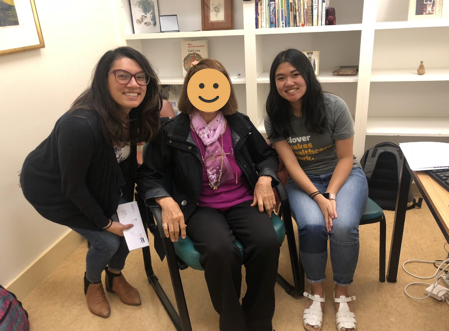
For privacy’s sake, I’ve censored the faces of some of the participants, but the product manager (Olivia) and I were conducting the user testing sessions.
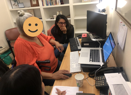
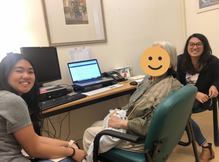
Clover members in New Jersey and Savannah
Finally we went to both our New Jersey & Savannah markets where we registered 9 Clover members for the My Clover using our production environment. This was exciting because it would be the first time we would be testing with a member’s real data, allowing them to fully be able to use the features we were showing them. From those user tests, we noticed that:
The registration flow was easy to go through and did not require much (if any) hand holding. All the members we tested with were able to complete registration on their own. We did acknowledge that there may be a selection bias here as the members we all tested with were self-identified as being relatively digitally savvy.
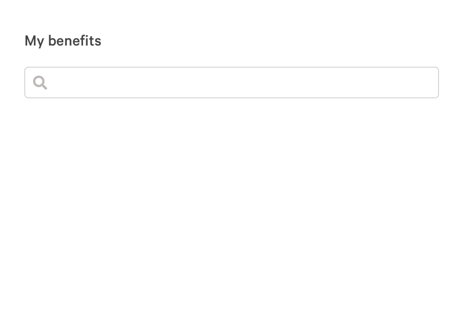
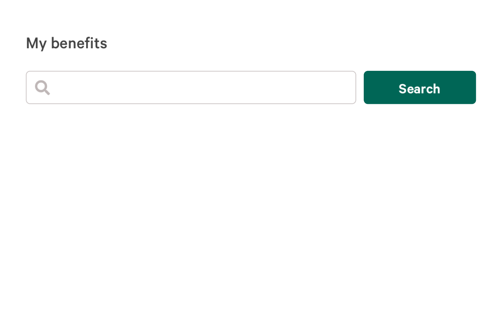
From the user testing in New Jersey, we also confirmed that the benefits search interaction was confusing to our members. The search bar was searching and filtering down the list of benefits as the user was typing. What we noticed from in-person usability tests was that our members often were not looking at the screen while typing. Instead, they would often look down at the keyboard (and their hands), essentially missing the on-screen filter interaction altogether. To help counteract that, we decided to build in an explicit “search button” and add additional language to make it more clear to the user when search results are displayed.
BEFORE
AFTER
Launch
We officially launched My Clover in late December 2018, thus allowing all new Clover members in 2019 to be able to log into the application. The product is currently available to all active Clover members. For reasons outside of our control, the launch and member application was never publicized or promoted widely. However, despite the lack of a product marketing push, we organically got a lot of sign ups from Clover members!
As of April 2019, we’ve tracked to having around 3% of all Clover members registered for My Clover. The industry standard is currently at 10% for the Medicare Advantage population.
1,300+ registered members
3.12% of all Clover members registered
3 average logins per user
Unfortunately, the live version of the application isn't publically available for a demo. However, you can try the prototype I created in Invision to get a sense of what the product can do!


